01 / Context
The challenge
The client’s website, product presentation and marketing material needed a more consistent identity. Visitors also needed a clearer route from understanding the company to finding documentation and starting a relevant enquiry.
02 / The thinking
A considered way forward.
- 01
Review the existing website, audience paths and brand assets to identify inconsistent presentation and unclear next steps.
- 02
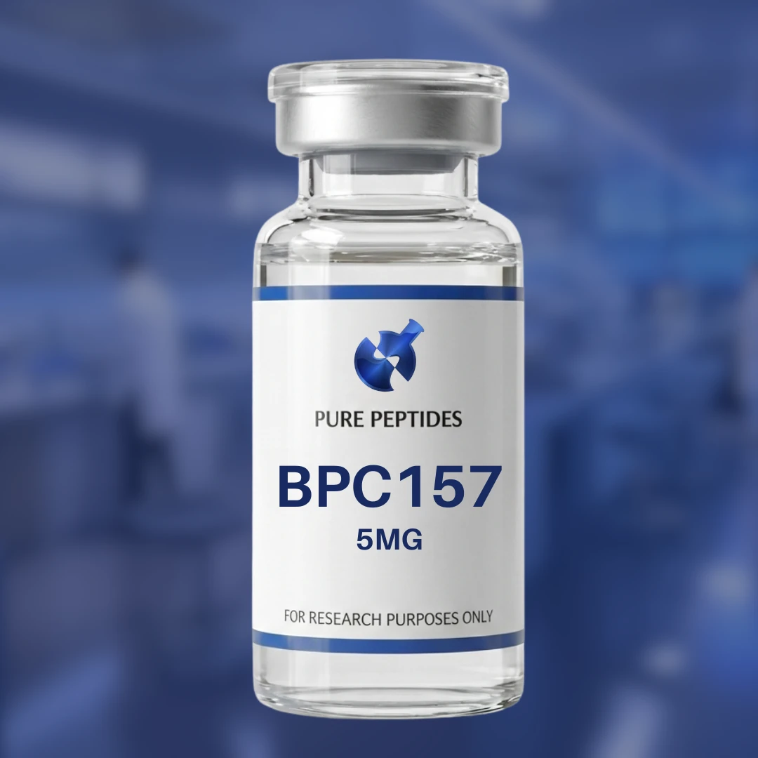
Carry the blue-and-white identity through typography, page hierarchy, product visuals and channel-specific creative.
- 03
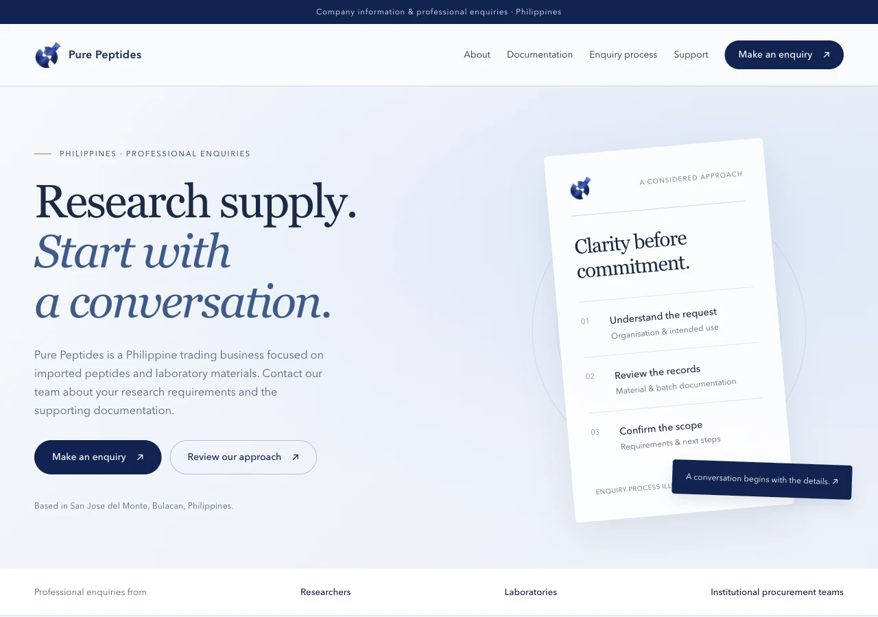
Organize the website around company information, documentation, support and a structured professional enquiry.
- 04
Prepare responsive review builds and handoff material, keeping proposed website directions distinct from released features.
03 / The making
What the work included.
- Website review and responsive design revisions
- Company, documentation, process and support page structure
- Professional enquiry interface and draft-message flow
- Branded product-presentation artwork
- Social and channel-banner creative
- Documentation and verification journey planning
- QA notes and implementation handoff
04 / Why it matters
Designed to be useful.
The work gives the brand a more coherent presentation across its website and marketing. A clearer information structure helps visitors understand where to go next, while reusable creative and documented page patterns support future updates. The enquiry concept also structures the information the team needs before continuing a conversation.
Client relationship and website, branding and marketing contribution confirmed by Nadine. The website image shows the October 21, 2026 local company-profile review build; it is not a current production capture. This version prepares an enquiry draft rather than sending it automatically. Product imagery is presented as design work. No sales lift, medical effectiveness or certification result is claimed.